So what does Innovation actually look like? Here's real-life examples of products we've tried and tested through our Innovation process, and what we learned on the way.
Safe?
In preparation for the National Youth Ministry Weekend 2018, we were excited to partner with safeguarding experts, thirtyone:eight to create a new resource to support youth workers in understanding and handling safeguarding concerns.
We knew we wanted to create something which
- conveyed the seriousness of the subject at hand while still being engaging
- offered an interactive experience to get teams talking about safeguarding
- helped youth workers work through realistic and relatable safeguarding situations in an appropriate context
We had our aim, now we needed a method for reaching it. For this, we used an iterative ‘trial and enhance’ method of idea generation, starting with a basic idea and creating a prototype to learn what worked and what didn’t, to inform the next iteration.
We started at the point of a child disclosing that something had happened – thinking it might offer a helpful context from which to simulate a decision-making scenario.
Prototype 1: Disclosure scenarios.
The first version of this resource featured four sets of cards, which generate random disclosures. Participants turn over a name, an age, a context and a disclosure, creating a scenario for discussion amongst the team about the correct responses.
We trialled prototype 1 with the team in the office. It did the job. To be honest it was boring, and far too simple. Here’s a scenario, discuss. Almost like an exam question. Nobody likes those.
What we learnt from this early version was that to properly handle a safeguarding situation, it’s important to be able to recognise the signs. We shifted our focus and created another version, this time using the indicators of abuse.
Prototype 2: Indicators of abuse
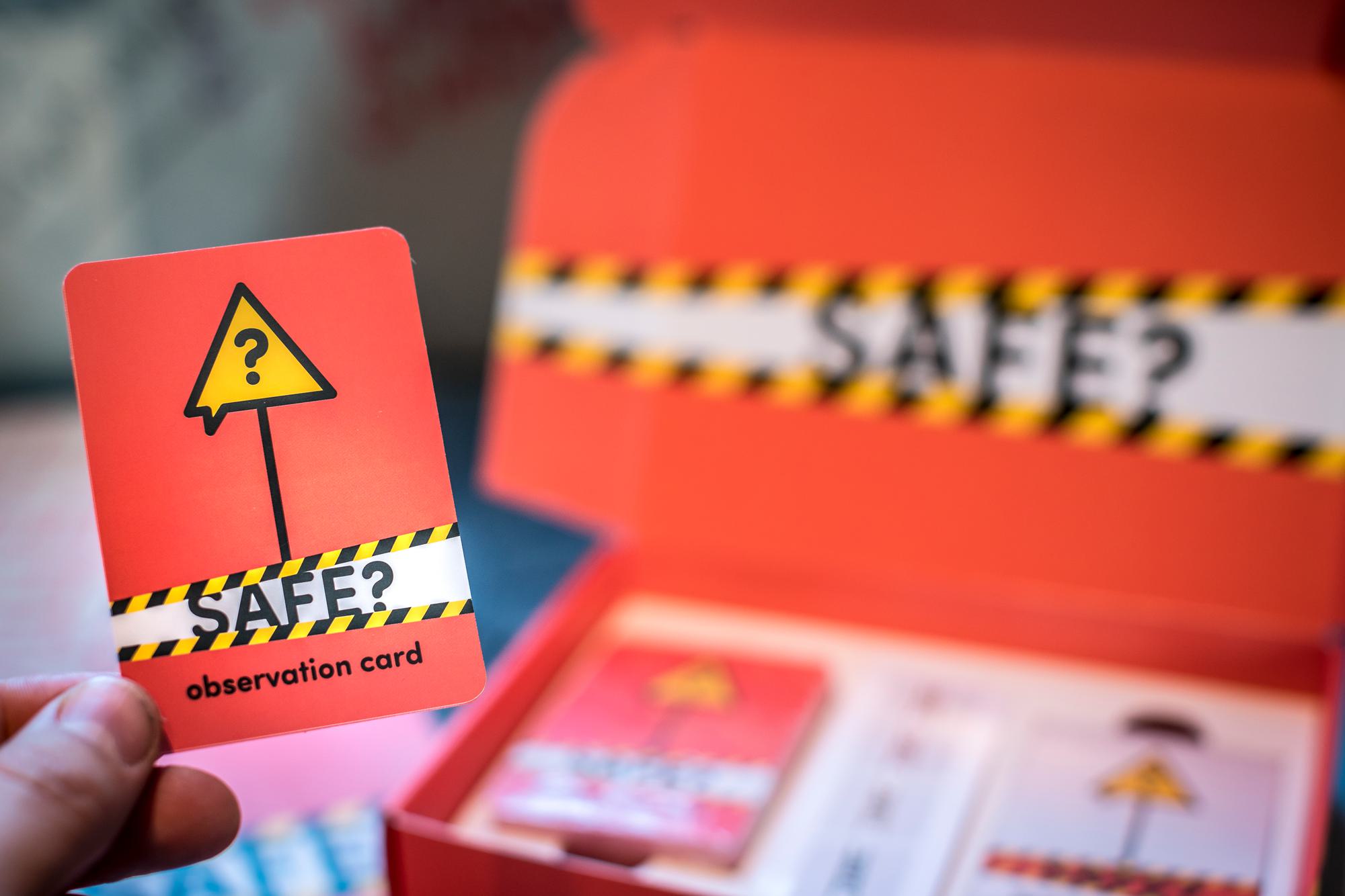
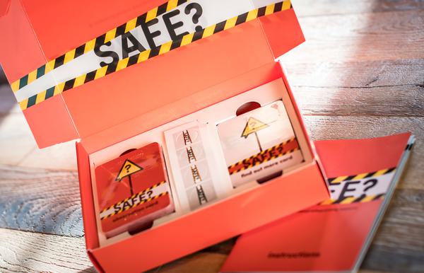
We moved on to a single set of cards, one for each of the indicators of abuse published by thirtyone:eight. Participants take it in turns to add a card to an imaginary set of case notes they are building for a young person, with each new card adding another element to the story. This opens up discussion amongst the group regarding what might be behind these observations and what the best course of action might be.
Prototype 2 grew as we trialled it. We had our MVP (minimal viable prototype). Every time we tried it, it worked – we found ourselves genuinely worried about the fictional young people we were creating, building possible back stories to explain the things we were noticing about them, predicting which card might come next and what might be the final element that tipped it into the realms of serious concern.
Prototype 2a: Types of abuse
For this first iteration we marked all the indicator cards with a letter to denote which type of abuse they signified, hoping it might increase the learning potential of the activity for participants.
Admittedly, the addition of the abuse categories did make it easier to spot what might be going on with the young person in mind. It was fairly obvious that if you’d turned over three or four cards with the same letter in the corner, you had a safeguarding concern on your hands. Frankly it was just too easy and real life isn’t like that. Version 2a didn’t last long.
Prototype 2b: Decision markers
We found we needed a way of each participant signalling how they were handling their safeguarding case at the end of each turn so we added four cards. Do nothing, observe, talk to the young person or refer to safeguarding lead.
Adding another dimension to the activity made a big difference – having to choose an action in response to the card and display it on the table forced some decisions when it had previously been easier to be vague and move on. Over time, these decision cards became a decision board with counters, inviting participants to place their counter on the board to show their decision.
Prototype 2c: Finding out more
Every time we used the prototype cards we found we were creating a back story for the young person in mind. Each observation card we picked up raised more questions and we could often think of feasible explanations for what the card said, which wouldn’t amount to a safeguarding concern. For example, lots of bruises might mean someone had been beaten, but it might also mean they play a fairly physical sport, so we decided to add some more information into the activity.
If a participant chose to talk to the young person (or parent, teacher etc) as their response to a card, they could now take a new card from a second set which gave more information about the young person. It might be directly relevant to the symptoms observed, or it might bear no relation at all; it’s up to the participant to decide what all the information points to and what might be an appropriate response.
If you’ve seen the Safe? resource, you’ll recognise it as being fairly close to version 2c. There have been other changes along the way, both in the minor detail and in bigger things such as the inclusion of a leaflet.
Developing and testing lots of different ideas about how the resource could work was crucial to helping us make Safe? a product that would genuinely help.
We’re really excited to have produced Safe? as a resource to enhance safeguarding training for all youth work teams.


